A/B Dashboard
* Paid plan only
Last updated
* Paid plan only
Last updated
IMQA MPM A/B Dashboard comprises an overview of indexes A and B and a comparison of project A to project B. Here you can monitor both Android and iOS apps, as well as the two projects.
You can change the Dashboard View to “A/B Dashboard“ from the “Dashboard“ toolbar. IMQA MPM A/B Dashboard consists of the following.
❶ Tool bar (A/B Dashboard) ❷ App summary ❸ Time series performance information ❹ Performance Issue rate ❺ Screen performance ❻ Performance indicators for the last 5 minutes ❼ Poor performance list
Currently, A/B dashboards in React Native projects are native data-centric. The component performance analysis function will be updated in the future.
❶ Dashboard information Displays the current Dashboard View mode.
❷ Project A information Displays the platform icon and name of the current project A.
❸ Project B information Displays the platform icon and name of the selected project B.
❹ App version of Project A You can change the app version of the current project A.
❺ Dashboard view You can change to a Dashboard View that shows different subjects.
❻ Select project B to compare You can select project B for comparison.
For more information on setting up projects to be compared, see 'Using MPM > Management > Project Management > Project Information > Project to be compared'.
❼ B Project app versions to compare You can change the app version of Project B to compare.
After entering project A, you can choose a different platform as project B for comparison and check the overview on A/B Dashboard.
Changes the dashboard view of the current project to “A/B Dashboard“.
Select a different platform project as project B to compare.
Select the previous version after entering project A → Select a same project as project B for comparison and check the overview on A/B Dashboard.
Select the previous version for the app version of the current project, and change the dashboard view to “A/B Dashboard“.
Select a same platform project as project B to compare.
You can view or compare the problem occurrence rate for the past 30 minutes and the user count and app launches in the last 24 hours for projects A and B.“App summary“ is updated every minute.
You can check the number of users and app launches from 00:00 on today's date to the current time.
Daily User: Counts the number of users for the past 24 hours. The count refers to the number of users alone, excluding duplicates.
Daily Run Count: Counts the number of app launches for the past 24 hours.
Daily User
Today's date 00:00 ~ Current time
Number of users
Counting
Daily Run Count
Today's date 00:00 ~ Current time
Number of app launches
Counting
One thousand is represented as “1K” for quick understanding. To view actual data, hover the mouse over “K” and the actual number will be displayed on a tooltip.
You can check the Avg Issue Rate and performance weather indexes in the past 30 minutes. ’Avg Issue Rate/Performance Weather' is updated every minute.
Avg Issue Rate: Calculates the average problem occurrence rate in which the data rate exceeds the threshold value of each performance index (UI Rendering Time, Response Time, CPU, Memory, and crash) for the past 30 minutes.
Performance Weather: Displays five-level weather icons depending on the Avg Issue Rate for the past 30 minutes.
Avg Issue Rate
Recent 30 minutes
Issue Rate
Issue Rate of each performance indexs
(Data above threshold / All data) * 100
Performance Weather
Recent 30 minutes
Avg Issue Rate
~20%, Step 5
The Avg Issue Rate and Performance Weather are useful in identifying the app-based performance for the past 30 minutes. The performance is quickly evaluated through the top evaluation index for each app.
Displays the number of occurred crashes, and the total average of the performance indexes (UI rendering time, response time, CPU, and memory usage) for the past 30 minutes on a time-series graph. You can check the point of performance degradation and trends of performance changes. Time series performance information is updated every minute.
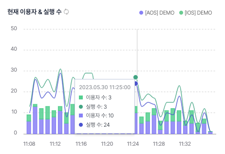
You can check and compare the user count and app launches for the past 30 minutes in one-minute interval. “Current users & Runs“ is updated every minute.
Current user: Counts the current user that occurred for the past 30 minutes in one-minute intervals. The count refers to the number of users alone, excluding duplicates.
Run count: Counts the app run count that occurred for the past 30 minutes in one-minute intervals.
You can check the UI rendering time for the past 30 minutes in a one-minute interval. Displays the total average, and the “UI rendering time“ is updated every minute.
Rendering time: Calculates the average of UI rendering times collected at 1-minute intervals for the past 30 minutes.
You can check the response time for the past 30 minutes in a one-minute interval. Displays the total average, and the “Response time“ is updated every minute.
Response time: Calculates the average of response times collected at 1-minute intervals for the past 30 minutes.
If response takes long, you can check for any network or server problems at a specific time, and analyze if there was an issue with a specific URL linked with “Top 6 URLs with Slow Response Time“.
You can check the number of occurred crashes for the past 30 minutes in a one-minute interval. Crash information is updated every minute.
Crash: Counts the number of crashes that occurred for the past 30 minutes in one-minute intervals.
You can check the CPU usage for the past 30 minutes in one-minute intervals. Displays the total average, and the CPU is updated every minute.
CPU usage: Calculates the average of CPU usage collected at 1-minute intervals for the past 30 minutes.
On average, the threshold of app CPU usage is less than 50%. If it exceeds 50%, the app is determined to have many tasks that use the CPU.
You can check the memory usage for the past 30 minutes in a one-minute interval. Displays the total average, and the memory usage is updated every minute.
Memory usage: Calculates the average of memory usage collected at 1-minute intervals for the past 30 minutes.
On average, the threshold of app memory usage is less than 100MB. If it exceeds 100MB, the app is determined to have many tasks that use the memory.
Displays a graph that shows the problem occurrence rate of five performance indexes (Crash, Memory, CPU, Response time, and UI rendering time) for the past 30 minutes for projects A and B. You can compare the ratio of data that exceeds the threshold or each performance index. “Performance Issue Rate“ is updated every minute.
Issue Rate: Calculates the ratio of data that exceeds the threshold for each performance index for the past 30 minutes.
Crash
Recent 30 minutes
Issue Rate
Number of occurred crashes
/ app launches
Memory
Recent 30 minutes
Issue Rate
(Data above threshold
/ All data) * 100
CPU
Recent 30 minutes
Issue Rate
(Data above threshold
/ All data) * 100
Response Time
Recent 30 minutes
Issue Rate
(Data above threshold
/ All data) * 100
UI Rendering Time
Recent 30 minutes
Issue Rate
(Data above threshold
/ All data) * 100
You can view the danger levels and performance indexes where problems occurred the most by projects A and B. The danger level is displayed as normal range, danger range, and warning range of the threshold.
You can set the threshold by performance index at “Management > Project Preset”.
You can view the distribution of the screen visited by users for the past 30 minutes for projects A and B. You can compare the average and problem occurrence rate of each performance and the number of visitors by screen. Screen performance is updated every minute.
❶ Performance index When there is a change in index, the below screen distribution graph is updated.
❷ Legend Displays the legend of the screen distribution graph. If you hover the mouse over, the bubble of the project is emphasized. Click this part for filtering.
❸ Screen type filter The filter is set to “All“ by default. It displays filters selectable by app type of the current project A. For the WebView/hybrid app, screen cards can be filtered by “Native” and “WebView”.
The screen type filter in A/B Dashboard is applied based on the app type of the current project A. If project A is a native app, only the native screen is displayed even if project B is a web/hybrid app. If you need an analysis even if there is no data, check A/B Dashboard based on the web/hybrid app project.
❹ Screen distribution graph Displays the screens visited by users for the past 30 minutes according to the distribution of the number of visitors, problem occurrence rate, and average.
❺ Expand/minimize/reset graph Hover the mouse over the screen distribution graph to show the graph. You can expand, minimize, or reset the graph. Drag the graph to expand it.
❻ Screen bubble Displays the screens visited by users for the past 30 minutes in bubbles.
Displays the distribution of screens visited by users in the past 30 minutes for projects A and B in a bubble chart.
❶ Bubble chart You can check the interaction and density through the bubble chart using three types of data. You can view numerous data all at once. Displays the determined priority according to the bubble size with the issue rate as the horizontal axis and the performance index as the vertical axis.
Rendering Time
Recent 30 minutes
Issue rate
UI rendering time(ms)
Visitors
Response Time
Recent 30 minutes
Issue rate
Response time(ms)
Visitors
CPU
Recent 30 minutes
Issue rate
CPU usage(%)
Visitors
Memory
Recent 30 minutes
Issue rate
Memory usage(%)
Visitors
❷ Clustering of screen bubbles Clustered screen bubbles indicate that multiple screens have similar performance levels and problems. The closer to 0, the better the performance level.
❸ Screen bubble deviating from clusters Screen bubble deviating from the cluster means that a specific screen deviated from an average situation. You can also check whether a majority or a minority of users experienced a performance degradation by referring to the problem occurrence rate and the number of visitors, which is represented by the size of the bubble.
❹ Project B baseline The horizontal dotted line indicates the threshold for each performance index of project B.
❺ Project A baseline The horizontal line indicates the threshold for each performance index of project A.
You can intuitively check the average performance of the app screen and the notable low-performance screen using the distribution graph of screens drawn from performance values and problem occurrence rates. The screen far from the distribution can be determined to be a screen unit that deviated from the app’s average performance. If the screens are widely distributed, try using them as improvement indexes for setting the app’s target performance.
over the mouse over the screen bubble to see a tooltip. With the tooltip, you can view the number of visitors per screen for the past 30 minutes, the average for each performance index, the issue rate, and the threshold. Click the screen bubble to move to the “Screen performance analysis“ page of the corresponding screen.
Screen name: Displays the name of the screen.
Average: Calculates the average of each performance index (Rendering time, Response time, CPU, and Memory) for the screen for the past 30 minutes.
Issue rate: Calculates the ratio of data that exceeds the threshold for each performance index for the past 30 minutes.
Threshold: Displays each performance threshold set for the project.
You can analyze the cause of the performance degradation in detail by referring to “Screen performance analysis“ of the screen where the problem was detected.
You can view the UI rendering time, response time, and real-time performance variation of resource usage for the past 5 minutes for projects A and B. You can also perform one-on-one management. The UI rendering time and response time for the past 5 minutes are useful when comparing or identifying the distribution of 5-minute groups. “Performance indicators for the last 5 minutes“ is updated every minute.
❶ Legend Displays the legend of the performance distribution graph. If you hover the mouse over, the bar of the project is emphasized. Click this part for filtering.
❷ Screen type filter The filter is set to “Native“ by default. It displays filters selectable by app type of the current project A. For the WebView/hybrid app, screen cards can be filtered by “Native” and “WebView”.
The screen type filter in A/B Dashboard is applied based on the app type of the current project A. If project A is a native app, only the native screen is displayed even if project B is a web/hybrid app. If you need an analysis even if there is no data, check A/B Dashboard based on the web/hybrid app project.
❸ A/B average Displays the overall average of response time and UI rendering time for the past 5 minutes for projects A and B.
A/B average: Displays the average of response time and UI rendering time for the past 5 minutes for projects A and B.
UI Rendering Time, Response Time
Recent 30 minutes
A/B average
Total average
❹ Performance rating graph Displays the performance data distribution for the past 5 minutes in histogram. The histogram shows class on the horizontal axis and frequency on the vertical axis. Classes are created by defining multiple sections for aggregated data and the frequency is indicated by the number of data that belongs to each class. The histogram is useful for identifying or comparing the distribution of the entire group.
UI Rendering Time
UI Rendering Time(ms)
0 ~ 5,000ms
Number of collected data
Response Time
Response Time(ms)
0 ~ 10,000ms
Number of collected data
You can check the performance environment of the app user by referring to the performance rating graph. If most of the users are distributed in the threshold range, we can see that the app is used smoothly. If they are distributed widely, it means that the app is not optimized for various user environments. You can use this information as an improvement index to set the target performance of the app.
❺ 50% baseline Displays the average performance baseline.
❻ 95% baseline Displays the baseline of bottom 5% performance.
❼ Section bar You can view the performance section and number of cases through the tooltip shown by hovering the mouse over the bar. Click the bar of the UI rendering time to display “Native stack analysis“ and “Web resource analysis“. Click the bar of the response time to show the “Detailed response analysis“ pop-up window.
Performance section: Displays the performance value section.
The number of cases: Counts the number of each performance data collected during the past 5 minutes.
Detailed linked analysis of data notable from the performance distribution graph is available. You can quickly view more details such as requests made by users and their environment with “Native stack analysis“, “Web resource analysis“, and “Detailed response analysis“.
❶ Legend Displays the legend of the bar graph. If you hover the mouse over, the bar of the project is emphasized. Click this part for filtering.
❷ A/B average Displays the overall average of memory usage and CPU usage for the past 5 minutes for projects A and B.
A/B average: Calculates the average of memory usage and CPU usage for the past 5 minutes for projects A and B
CPU, Memory
Recent 5 minutes
A/B average
Total average
❸ Bar graph The bar height of the CPU is shown based on 100%. The bar height of the memory is shown in relative ratio with the highest bar as 100%. Click the bar of the CPU to display “Detailed CPU analysis“. Click the bar of the memory to show the “Detailed memory analysis“ pop-up window.
Average: Calculates the average of memory usage and CPU usage for the past 5 minutes.
CPU
Recent 5 minutes
CPU usage
Total average
Memory
Recent 5 minutes
Memory usage
Total average
Detailed linked analysis of data notable from the bar graph is available. You can quickly view more details such as functions called by users and their environment with “Detailed CPU analysis“ and “Detailed memory analysis“.
Displays the top 4 crashes that occurred most frequently in the past 30 minutes for projects A and B. Crashes are sorted by the highest crash count. If the crash name is too long, hover the mouse over the name to display the full name as a tooltip. “Top 4 Crashes“ is updated every minute.
Crash: Displays the name of the errors. Click the item to move to the “Error details“ page of the corresponding crash.
Count: Cumulatively counts the number of errors that occurred in 30 minutes.
Ratio: Cumulatively counts the number of errors that occurred in 30 minutes.
Displays the top 4 URLs with slow response time on average in the past 30 minutes for projects A and B. The order is sorted by the longest response time. If the URL is too long, hover the mouse over to display the full URL as a tooltip. “Top 4 URLs with Slow Response Time“ is updated every minute.
URL: Displays the requested URL. Click the item to show the “Detailed response analysis“ pop-up window.
Count: Cumulatively counts the number of requests for the URL in question for 30 minutes.
Response time: Displays the response time of the URL in question.
Top 4 Screen by views displays the four most visited screens for the past 30 minutes for projects A and B. The default order is by the highest number of views. If the screen name is too long, hover the mouse over the name to display the full name as a tooltip. “Top 4 Screen by Views“ is updated every minute.
Screen: Displays the names of Native and WebView screens. If the screen name is too long, hover the mouse over the name to display the full name as a tooltip. Click the item to move to the “Performance analysis by screen“ page of the corresponding screen.
Visitors: Counts the number of users who have visited the screen. The count refers to the number of users alone, excluding duplicates.
Views: Counts the number of visits for the screen.